All Articles
Redesigned Orca Charts
November 12, 2022 • 6 min read
Orca Charts have been redesigned for a better planning and navigation experience

We recently introduced significant changes to Orca Charts. The most noticeable changes are redesigned light sectors, improved contours in shallow waters, and the addition of tide overfalls. In addition, every part of the Orca charts has been fine-tuned to align with our design principles.
Keep reading to learn how Orca Charts design principles make them better than other electronic charts.
Designing Orca Charts
Orca Charts are carefully designed to balance legibility with information density. The goal is to minimize the time and cognitive effort you need to understand your surroundings. One challenge in this balancing act is that coastlines are very different around the world. In some regions, the coastline is simple. It means navigation is less complex, and charts are easy to design.
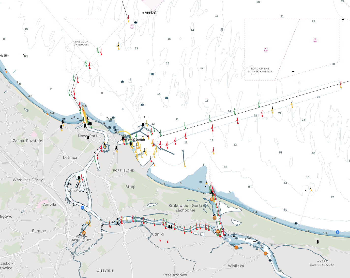
The Gdansk Port Entry. The commercial and non-commercial harbor entrances are clearly marked and navigation and chart-reading are straightforward.
In other regions, the coastline is complex – navigation is more demanding and chart legibility becomes an important factor for safety. This makes digital chart design challenging.
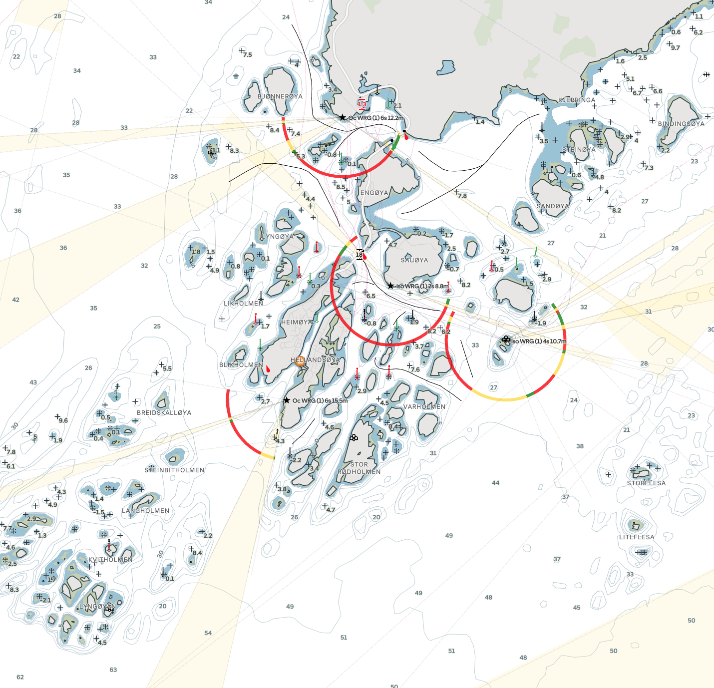
Charts around Heimøya. The complex coastline and multitude of approaches make navigation challenging – in particular when the sea state is bad.
We follow three key principles for the design of Orca Charts:
Charts must emphasise features that are critical for safe navigation
Non-critical information must be visible, yet draw as little attention as possible
Charts must be consistent and retain a predictable level of detail across all zoom levels
Easy-to-read charts may sound like a nice-to-have, but we believe it is the most important feature of a navigation system.
The infamous Vestas grounding in the Volvo Ocean Race was a result of electronic charts not abiding by the principles above.
Chart design is at the core of what we do in Orca, and it's the reason why we build our own charts rather than license from others.
A case-study of Orca and Navionics
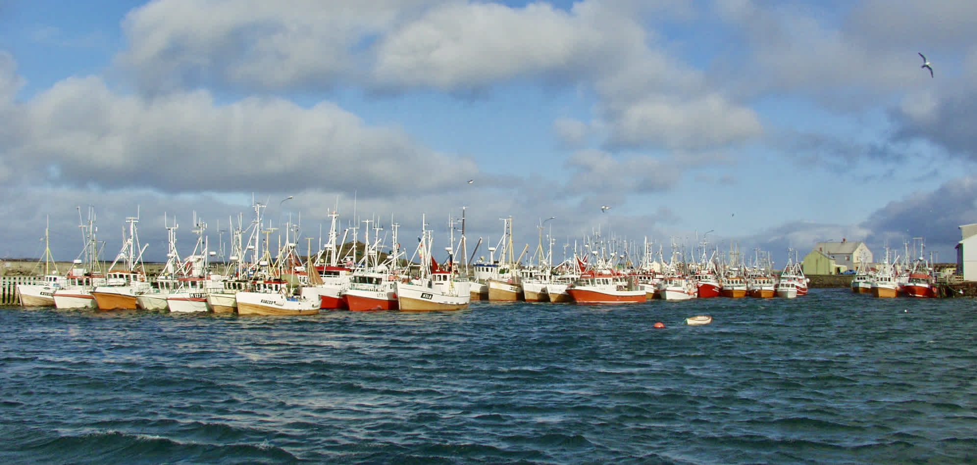
The fishing fleet in Røst during Lofotfiske. Image courtesy of Redningsselskapet.
Røst is a small island located in Lofoten, Norway. The island houses a small fishing community, and during the yearly "Lofotfiske" fishing season, the island's population doubles to accommodate fishermen from near and far. This is a challenging and demanding area to navigate, yet it sees a lot of traffic. We’ll use this area as an example to study design tradeoffs between Navionics and Orca at three different chart scales. Røst was chosen because Orca Charts and Navionics are built on the same source data in this area.
In the study, both charts are adjusted to a depth threshold of 5 meters with all other settings to default.
Coastal
At low zoom levels, often called “Coastal”, you want to be able to understand the major features and passages in a certain area.
Coastal scale comparison of Navionics and Orca.
Several major design differences separate Orca and Navionics at this zoom level. Navionics uses a generalized representation of depth areas, while Orca shows an accurate representation that carries through all zoom levels. Navionics' light sectors are scaled up. It makes them easy to spot, but the overlap makes them difficult to separate.
Orca’s light sectors don’t overlap. Instead, leading light sectors are highlighted and extension lines are used to draw your attention toward the light sector. These extension lines also represent the range of the light sector. Navionics doesn't indicate light range nor show show any place names. Orca shows the name of the largest island.
While none of these differences are likely to cause larger issues during planning, Navionics users will probably need to zoom in to get a similar understanding of the area compared to Orca users.
Approach
At medium zoom levels, often called “Approach”, you want to understand the passage options that are available in the area and identify your key aids to navigation such as lights and buoys.
Approach scale comparison of Navionics and Orca.
The first thing you may notice is that contours and rocks are shaded differently in Navionics and Orca. Navionics uses black, while Orca uses a lighter blue shade for contours. Navionics highlights shallow rocks in red, while Orca shows them as dark blue.
These design choices have significant consequences for chart legibility. Navionics’ recommended tracks, caution areas, information areas, and ferry routes use the same magenta color. This choice of color makes them hard to differentiate.
Orca uses black lines to emphasise navigable tracks. In Orca, the magenta color is reserved for non-critical information. In Orca Charts, you can clearly see the recommended track along the shallow northern approach. You can also see the dashed ferry route, with a ferry symbol along the southern approach.
Navionics don't show light characteristics, while Orca follows the standard paper chart symbology. On top of this, Navionics’ underwater rocks don’t show depth values at this zoom level. This could be because the red highlight makes the chart cluttered enough as it is. Orca Charts show depths for selected rocks where there is sufficient space to place a label: Where multiple rocks overlap at this scale, the shallowest rock’s label is shown.
While you could argue that all rocks shallower than your safety depth are equally important at an approach scale, we believe that you should be able to differentiate them even at this zoom level.
Once again, Navionics forces you to zoom in further to understand the main navigation challenges in the area. Certain approaches, such as the shallow northern approach via the recommended track are hard to discover in Navionics compared to Orca.
Harbor
At high zoom levels, called “Harbor”, you want details without clutter. Navigation critical information should be easily recognisable at a glance because your attention should be focused on your surroundings rather than your navigation display.
Harbor scale comparison of Navionics and Orca.
The key design difference between Navionics and Orca is that Orca scales up the size of symbols at high zoom levels.
The difference is quite noticeable: rocks, marks, and buoys are twice as large in Orca, while Navionics keep them at the same size through all zoom levels, making it hard to separate marks and labels.
The color palette is also significantly different. Orca consistently uses magenta for non-critical information elements, such as pipelines, underwater cables, and information areas. These elements are separated by the type of symbols used: Underwater cables and pipelines follow paper chart symbology for easy interpretation.
Navionics displays pipelines in black, cables in red and information areas in magenta.
Remember shallow rocks were red in Navionics as well? Humans use color as the primary visual cue for identifying features in a map*. The drawback of this approach is that red is both used as a representation of danger, and as a representation of non-critical information – making it tougher to separate and categorize the information.
Orca also reduces the density of soundings deeper than your depth threshold. As a result, navigable areas can be identified by the absence of clutter, making them easier to find.
By reducing clutter and using colors consistently, Orca Charts make it easier to keep a visual snapshot of the chart area in your head.
It means you can stay more attentive to your surroundings, and take quick glances at your chart display rather than having to read the fine print during a hectic situation.
Skim-readable charts
Ultimately, Orca Charts are designed to be skim-readable.This is a consequence of the three design principles we employ at Orca and the careful act of balancing non-critical and critical information.In Orca Charts, every zoom level is carefully designed to emphasize relevant information, and the transition between low and high zoom levels is consistent and predictable.
These things may sound like a detail – but details like these can make the difference between a stressful and smooth harbor approach. These are the kind of details that give you the confidence to explore new areas.
This is why Orca is the navigation for the modern boater.
Better Boating with the Orca Core
While mobile devices are great tools for navigation – they can fall short: Mobile GPS accuracy is often unreliable, and your mobile device doesn't connect to your onboard sensors, like a transducer, engine, or fuel tank.
This is why we made the Orca Core.
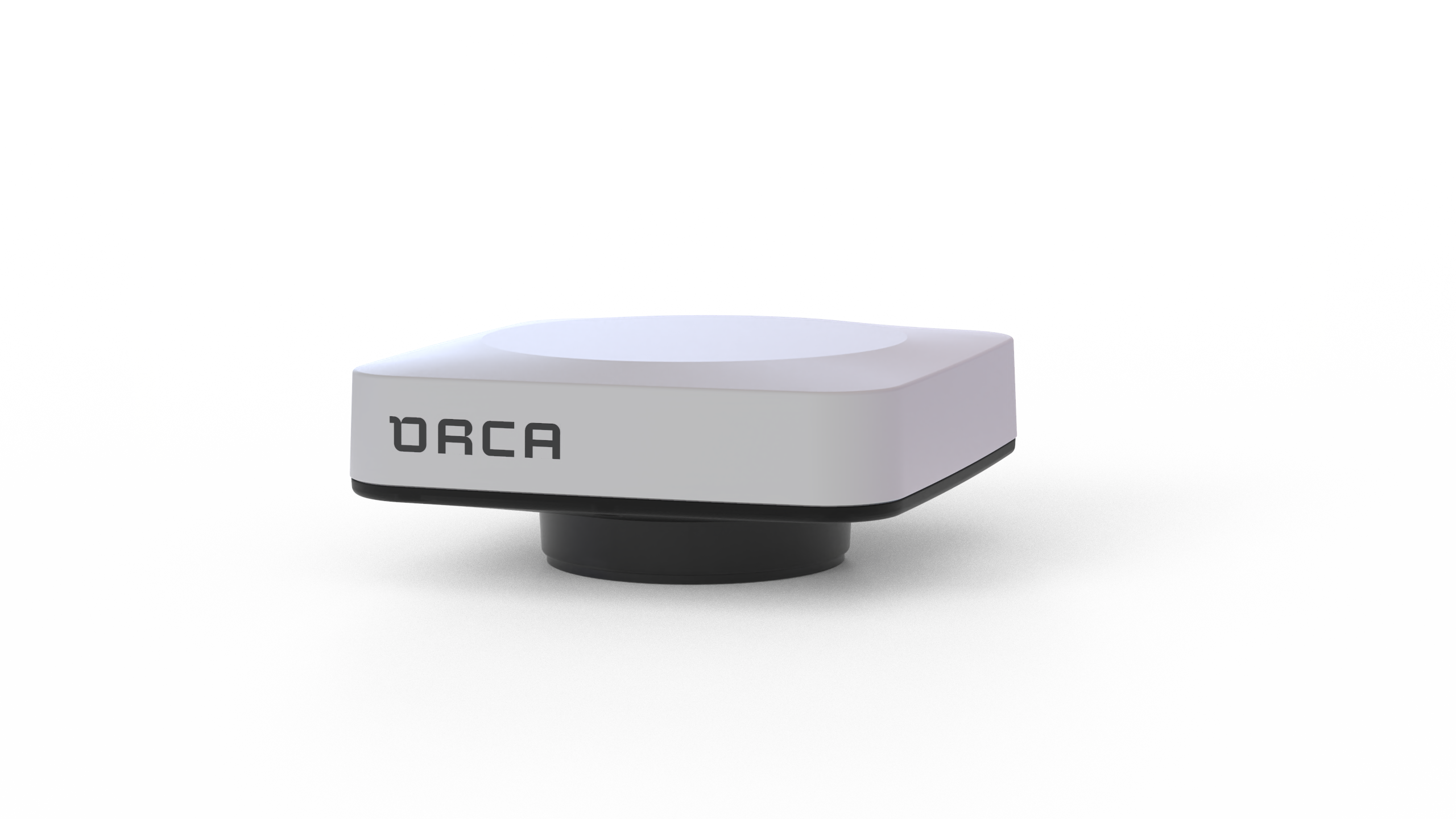
Orca Core powers advanced features in Orca.
The Orca Core is a Smart Navigation Hub with a built-in high-accuracy GPS and compass that connects to your boat’s sensors. This Smart Navigation Hub broadcasts sensor data wirelessly to your Orca App and Orca Display, turning them into fully featured navigation displays.
The Core serves as a wireless gateway to your boat sensors, allowing you to view depth, wind information, and engine data on your phone and tablet. Best of all, it is installed in just a few minutes.
Order your Orca Core and your Orca Display
It’s delivered with free express shipping and backed by a 30-day satisfaction guarantee, so you can try it risk-free.
* Making Maps Easy to Read—A Summary of Research, Richard J. Phillips


